Creating a logo for software or an app
Every day, new software, apps and SaaS products are born, often carried by one or two passionate people. Their logo is the first thing a user, a client or an investor discovers, in an app store, a browser tab or a pitch deck. Here is what it has to achieve, and the right moment to give it a real identity.
In short
- At the start, a simple and readable logo is enough.
- The wider your market, the more unique your identity needs to be.
- A software logo lives at a tiny size, on light backgrounds as on dark ones.
- It can tell what your product does.
- A professional identity reassures your clients and your investors.
- Working with a designer also brings a fresh eye on your product.
At the start, a simple logo is enough
When you build your product on your own, the budget goes to the product first, and that is perfectly normal. For your first users, a simple logo is more than enough, your name in a beautiful typeface or a very plain symbol, made yourself or with the help of an AI. What matters is that it is readable and useful. There is no need for effects or details, they get lost at small sizes and age quickly.
Simply keep in mind that a free or generated logo has its limits, it is often neither unique nor truly yours. I explain why in is a free logo really yours. Then, when your first clients or a first budget arrive, an identity designed for your product is one of the best investments you can make in its image.
Standing out among thousands of products
Thousands of software products come out every year, and many of them answer the same need. It then all depends on your market. A tool designed for the physiotherapists of your region already stands out through its speciality and its proximity. A product aimed at the whole world meets hundreds of competitors in every app store and every comparison, and it needs a truly unique identity to be remembered.
Design and identity are among the surest ways to stand out. The name matters a lot too. A free name, one that nobody else carries on the web, leaves all the room to your product, in search results as in the app stores.
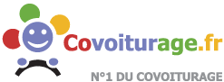

BlaBlaCar
Covoiturage.fr said what the site did, but the name could not travel. BlaBlaCar, inspired by the Bla, BlaBla, BlaBlaBla scale that tells whether you like to chat during the ride, is easy to remember in every language and has become the reference for carpooling in Europe.
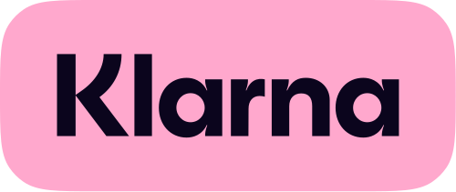
Klarna
In a sector where almost every bank is blue and serious, Klarna chose pink in 2017. You recognise it at a glance on a checkout page.

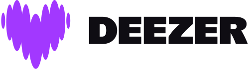
Deezer
In 2023, Deezer replaced its equaliser with a purple heart, together with a darker app. The logo no longer only shows music, it tells what you feel when you listen to it.
Duolingo
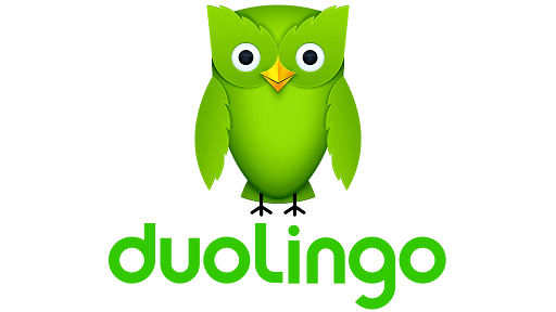
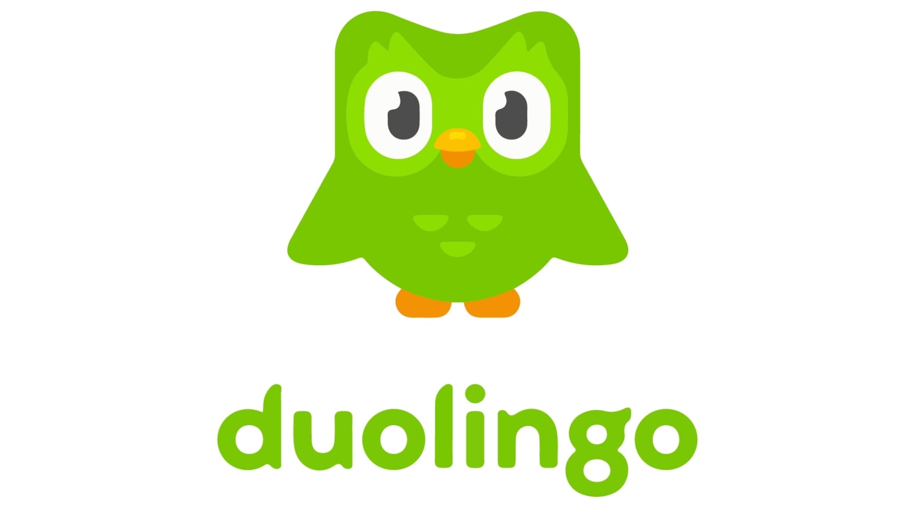
In 2019, Duolingo redrew Duo, its owl, rounder and able to express emotions. It is the owl people remember about the app, far more than its features.
What a software logo has to get right
A software logo lives in many more places than the logo of a traditional business, and often at a tiny size. Before choosing it, check that it holds up in each of these uses:
The browser tab
As a favicon, it appears at 16 pixels next to the page title, and Google shows it next to your results.
The app icon
In a square with rounded corners on iOS, sometimes cropped into a circle on Android, it stays recognisable.
Dark mode
It works on light and dark backgrounds alike, without losing its colours or its contrast.
The interface
In the header of your software, it accompanies every screen while leaving all the room to your content.
Avatars
On social networks and platforms, it is often cropped into a circle.
The app stores
It sits among dozens of other icons, and that is where it has to stand out.
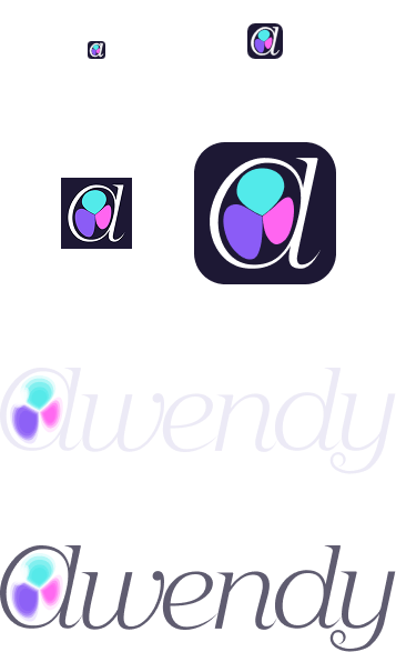
This is why a software logo is often designed in two parts, a symbol that works on its own at a tiny size, and the written name for larger formats. For Awendy, the app I am building to organise ideas, the “a” serves as the icon at every size, and the full name joins it whenever there is room. The coloured shapes inside the “a” are cells. In Awendy, each project is an embryo, made of cells you add to grow your ideas into something tangible.
As a developer, I also think about its place in the product, with files ready for each platform and colours that match the interface.
Telling what your product does
A good logo can tell what your product brings without spelling it out. This hidden meaning is not always noticed at first glance, but it gives the logo its accuracy, and it stays in mind once discovered.
That is what I looked for with Stiip, my app that creates cycling loops full of climbs. Its name comes from the English word “steep”, like the climbs cyclists look for, and I replaced the two “e” with two “i” so it reads easily in every language. In the logo, the “S” becomes a cyclist in full effort, leaning as on a climb, the “T” the fork of the handlebars, and the dot of the “i” the rider's head. Even without speaking English, you understand straight away what it is about.
The name and the logo came very quickly, like a spark, and I drew it in an hour or two. It does not happen with every project, but when the idea of the product is clear, the logo often follows naturally.
An identity that stands apart from generated visuals
In app stores and marketplaces, more and more software and games use logos and visuals generated by AI. They often share a family resemblance, the same gradients, the same shine, the same rounded shapes, and many users have learnt to spot them at a glance.
An identity designed for your product naturally stands out from that crowd. It shows the care you put into your work, and it is also fully yours, whereas a visual created entirely by an AI may not be protected by copyright, as I explain in the article on free logos.
The care you put into your identity hints at the care you put into your product.
Reassuring your clients and your investors
Software calls for trust, and a professional identity gives your product a real face, on two sides at once.
Your clients
People entrust software with their data, their time, sometimes their whole daily work. A professional face gives them a mark of trust to rely on from the very first visit.
Your investors
They see many projects go by. A product that presents itself with a solid identity, from the logo to the pitch deck, shows that the people behind it take it seriously.
And that face matters to you too. Seeing your product with a real identity is often what makes it tangible, and what makes you want to take it even further.
An outside eye on your product
Working with a designer is also a collaboration. To draw your logo, I discover your product, I try it and I ask questions. This fresh eye often brings more than a logo. A remark on a screen to clarify, an idea for your home page, the feedback of someone discovering your tool for the first time.
When you build a product on your own, these exchanges are precious. For a few hundred euros, you gain a logo, and also one more partner in your network, who knows your product, can talk about it around her and adds it to her own portfolio, seen by other professionals.
A logo that grows with the product
Your product will evolve, and its logo can evolve with it. A well-built logo keeps its shape and its idea, and its details are refined over time, a colour, a gradient, a stroke weight. For Stiip, the logo will keep the same illustrated cyclist, but some of its lines will evolve with the app.
That is also the lean startup spirit, starting with the essentials and improving them as feedback comes in.
A logo for your software
€550 excl. VAT
That is the fixed price of a logo designed for you at EYN Studio, made to live in your product:
- Unique, drawn by hand on a blank page, from what your product does.
- Yours, with a written transfer of rights, on payment of the final invoice.
- Ready for every screen, from the favicon to the app icon, in light and dark versions.
- Designed by a developer, who knows the constraints of an interface and of each platform.
All the details, from the steps to the files delivered, are in how much does a logo cost.
Your questions
How much does an app logo cost?
Expect €300 to €1,500 on average with an independent designer. At EYN Studio, logo design comes at a fixed price, €550 excl. VAT, with the transfer of rights included.
Can I use a logo created by AI?
To get started and test an idea, yes. It will not necessarily be unique or protected by copyright, so it is better to replace it with a designed identity once your product starts to grow.
What size should an app icon be?
The App Store asks for a square image of 1024 pixels per side, and Google Play for an icon of 512 pixels. For the favicon, Google recommends a square image larger than 48 pixels per side. Most important of all, the logo has to stay readable when it is displayed at a tiny size.
Should I use a symbol or the written name?
Both, ideally. The symbol alone for small sizes, such as the favicon and the app icon, and the full name when there is room, on your website or in your presentations.
When should I hire a designer?
As soon as your product finds its first clients, before publishing it in the app stores or presenting it to investors. That is when a real identity helps it grow the most.
Want to give your software a real face? I draw every logo by hand, on a blank page, and everything is presented here.
Thanks for reading
Written by
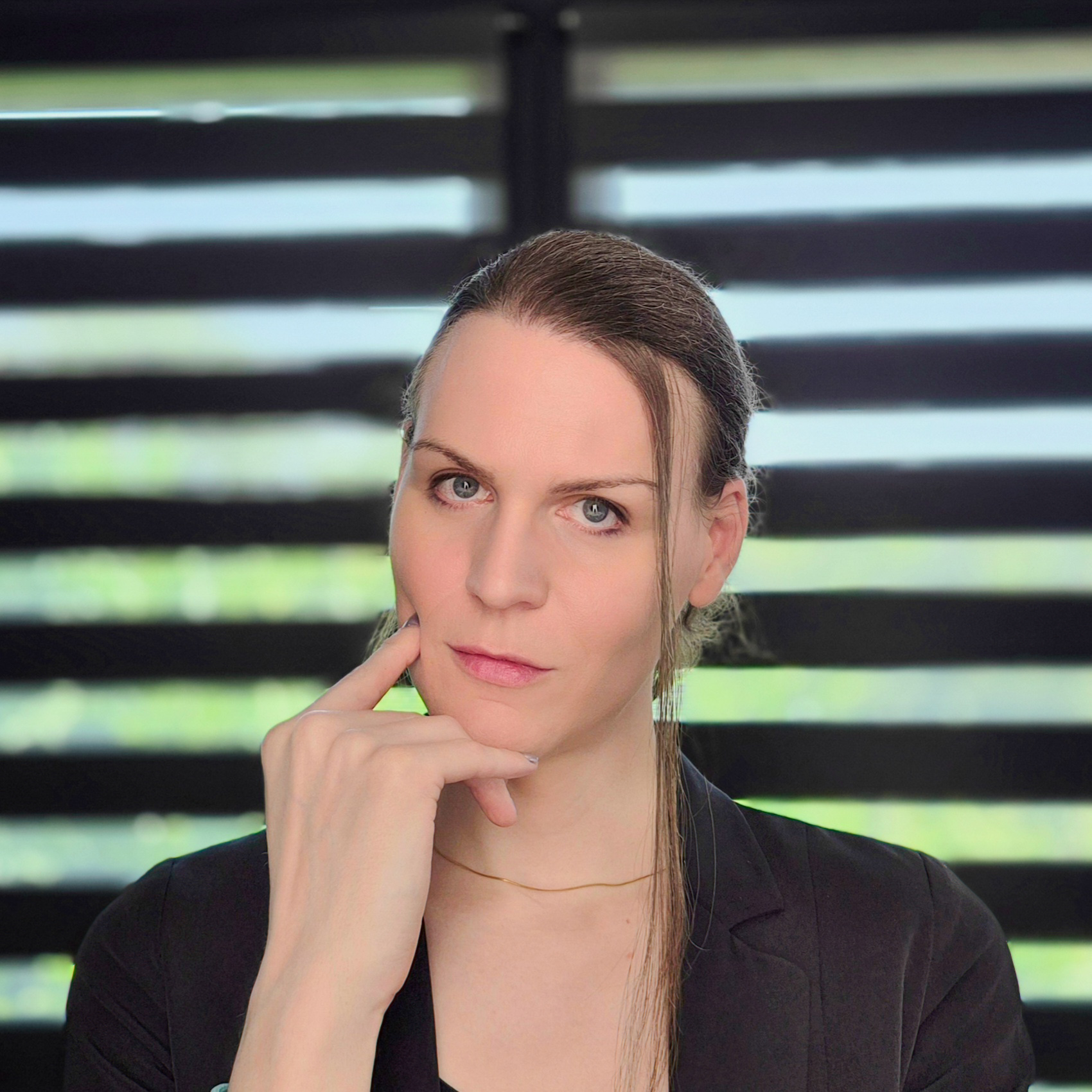
Lexy Callemeyn
Graphic designer & web developer
Hello! I'm Lexy, a graphic designer and a developer of websites and apps for 12 years. Every project is unique to me: I draw logos and I build custom websites for freelancers and companies, from the first sketch to going live, to help them reach their goals with a strong identity online.
A question, a project in mind? Write to me, or discover my work through the links below.
And now?
Want to go further?
Let's talk about your logo
Read next