Why I draw the logo before the website
When you start a website project, you first think about everything you will put in it, about its goals, the pages, the texts, the photos. If that site extends a business you already run and your logo is recent, that is the classic case and it is perfect. But if you do not have a logo yet and you are thinking of investing in a website, let me explain why it matters to create your logo before anything else.
The logo is the first visual decision
A logo is the very first visual decision of a project. Everything that comes after inherits from it, often without anyone noticing. Your business cards, your invoice header, and so on.
Because a logo is not just a small drawing. It already carries three things with it.
- Colours. A main hue, sometimes one or two that go with it, with their shades and their contrasts.
- A character. A way of drawing the letters, more or less round, more or less assertive, with angles or with curves.
- A geometry. Angular or supple shapes, a dense or an airy drawing, a calm composition or one in motion.
These three elements exist long before the first page of the site. They are not there for nothing, and they set the tone for what follows.
What the logo concretely brings to the site
Let us take those three elements one by one, and see what they become once they are on a screen.
The palette. Your logo holds at least one colour, most often two or three. A site needs many more, depending on the case: light tones for the backgrounds, a well-contrasted one for the texts, an accent kept for the buttons and the important actions. That complete range, I do not invent it next to the logo, I draw it out of it. I lighten, I darken, I vary, but I always start from your colours so that the harmony holds.
A word on legibility while we are here. A logo can live very well with soft contrasts: you see it large, and only once. A page of text cannot. When your palette is gentle, I keep your colours but adjust the tones for reading: the text darkens, the light hues stay for the backgrounds and the small decorative touches. Your identity stays intact, and your site reads without effort (and by everyone, which counts for search too).
The character of the letters. The letters of the logo guide the choice of typeface for the texts. Not necessarily the same one, but one that gets along with it. A logo with round, generous letters calls for a supple typeface. A sharper logo calls for something crisper.
The rhythm of the shapes. Round or angular, dense or light: what is in the logo comes back in the shape of the buttons, in the corners of the boxes, in the space between the sections. That is what makes a site seem to "go with" its logo, without anyone always being able to say why, and yet all of it is deliberate.
The level of contrast. A very contrasted logo, black on white, gives a frank site. A logo all in shades gives a more hushed one. That setting is decided once, in the logo, and it colours everything else.
The world your logo opens
A logo is also an invitation. It already sets the world your site is going to enter, and that world can be read in the way it breathes.
Look at your logo. If the letters are spaced out, if the drawing leaves plenty of emptiness around it, your logo breathes. The site will be able to breathe too: wide margins, few elements per screen, a lightness.
If on the contrary your logo sits on a block of solid colour, or if its shapes are tight, it invites something else. A site you dive into, where colour carries the page, where you feel surrounded.
Both are right. What matters is that the site follows the logo's invitation. A very airy site under a dense logo, or the other way round, gives that impression of mismatch your clients feel without being able to name it. When the two breathe at the same pace, everything seems obvious.
And if your logo already exists?
Most of the companies I work with already have a logo. And the first thing I do is listen to it.
What we do with it depends on two things: how far it has already gone out into the world, and what it means to you.
Your logo is everywhere. Painted on the showroom, embroidered on the jackets, printed on the vans and on ten years of quotes. Then it stays, as it is. The site adapts to it, and that is perfectly normal work, not a compromise: I take its colours, I extend them for the screen, I choose a typeface that agrees with its letters, I build the space around its density. Nobody reprints anything.
Your logo has a history. A family business, a logo drawn by a parent, passed from one generation to the next. Its value is not measured by its perfection. We keep it, we respect it, and we build around it. A beautiful logo that has aged well is the best possible case.
Your logo has aged. Twenty years of business, a logo made at the start, and not that much printed material. There, there is room to move, without redoing everything. A reworked contrast, a cleaned-up outline, tones adjusted for the screen. Your clients still recognise it, and it stands up again next to a modern site.
For a company, changing its logo, or even its name, is a very strong signal sent to everyone, to the employees as much as to the partners and the competitors.
In every case, we look at it together. I give you my reading, and the decision is yours.
A simple way to gauge how much your logo matters in your daily life is how much you use it. If you do not use it in your professional communication, for example if you would rather type your company's name than place the logo image on your invoices or at the end of the emails you send, those are signs.
The same hand from start to finish
Like a lot of people, I have plenty of passions in life, but oddly the ones that thrill me most are those combining an artistic and a technical side. Graphic design and user-interface development meet that criterion and tick every box, but on top of that they complement each other and reinforce one another to unlock wild possibilities, quite apart from being enormously valuable professionally.
In the creation of a logo, every detail is calculated, every curve, every stroke, every letter. Nothing is left to chance.
When both come from the same person, nothing is lost along the way. No brand guidelines handed to another studio and interpreted differently. The decisions taken in the logo pass straight into the site, because it is the same hand carrying them.
Your logo gives a foretaste of your world. The site makes it visitable. And if the same person handles both, all the information is already known to them, which keeps it from getting lost and saves you repeating your needs, your story and everything the one or the other has to sell.
So, we draw the logo first
That is why I start with the logo. Not on principle, but because it already holds most of the answers to the questions the site is about to ask: which colours, which character, which rhythm, which world.
Draw it first, or have it looked at before you launch your site. The rest will follow, naturally. And if you want to talk about it, do get in touch.
Want to go further?
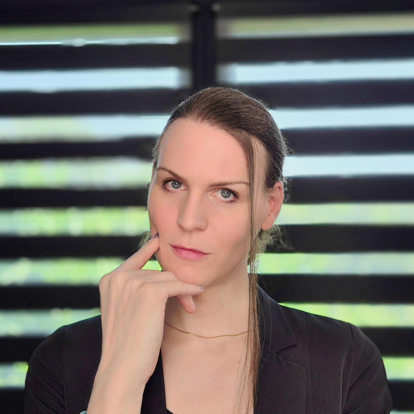
Hello! I'm Lexy, a graphic designer and a developer of websites and apps for 12 years. Every project is unique to me: I draw logos and I build custom websites for freelancers and companies, from the first sketch to going live, to help them reach their goals with a strong identity online.
A question, a project in mind? Write to me, or discover my work through the links below.