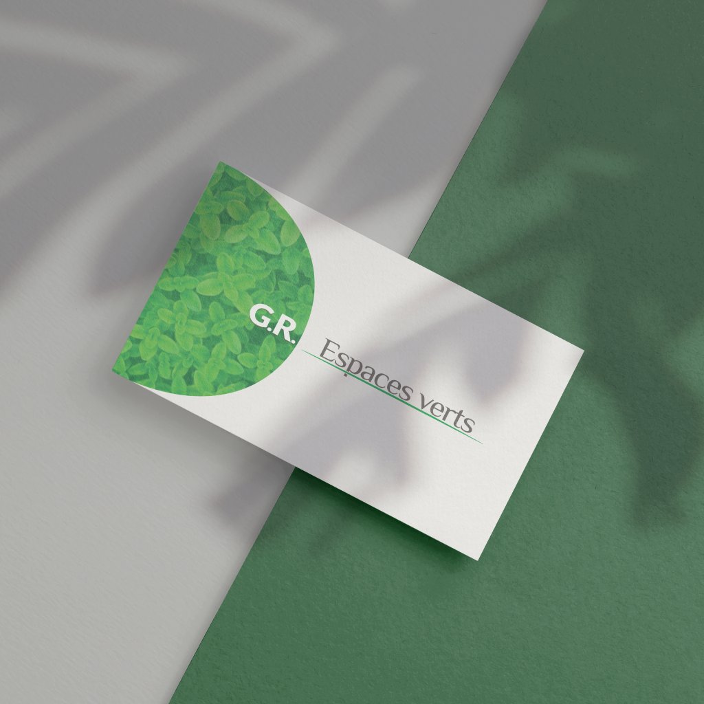
The logo of a garden and green spaces company founded by two former colleagues, a half circle drawn like the arc of a mower, then their business cards and a large banner for their worksites.
The context
Two colleagues left their jobs to found their own company, designing and looking after gardens and green spaces in the Verviers and Liège area, for private clients as well as companies. The G and the R are their two initials.
They needed business cards but did not have a logo yet, so we started with the logo.
The logo
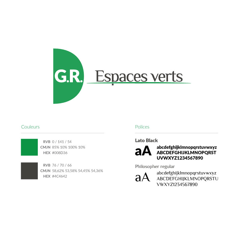
The two initials, set in a sans-serif, sit inside a half circle. In the flat version, the half circle is green and the letters white, and the colours can be reversed. In the detailed version, the half circle opens onto foliage, a bush seen up close.
The half circle is the arc a mower or a brushcutter draws as its blade turns. The idea opens many doors, like a photo where only the half circle is freshly mown, under the initials, while the grass grows taller all around it.
This half circle works on its own, as an emblem. Beside it, the words Espaces verts are set in Philosopher, a typeface with slightly flared ends, in a warm dark grey, on a fine green line that draws the ground. Green for the foliage and a warm grey for the earth, the colours of the garden itself.
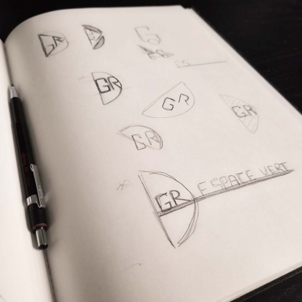
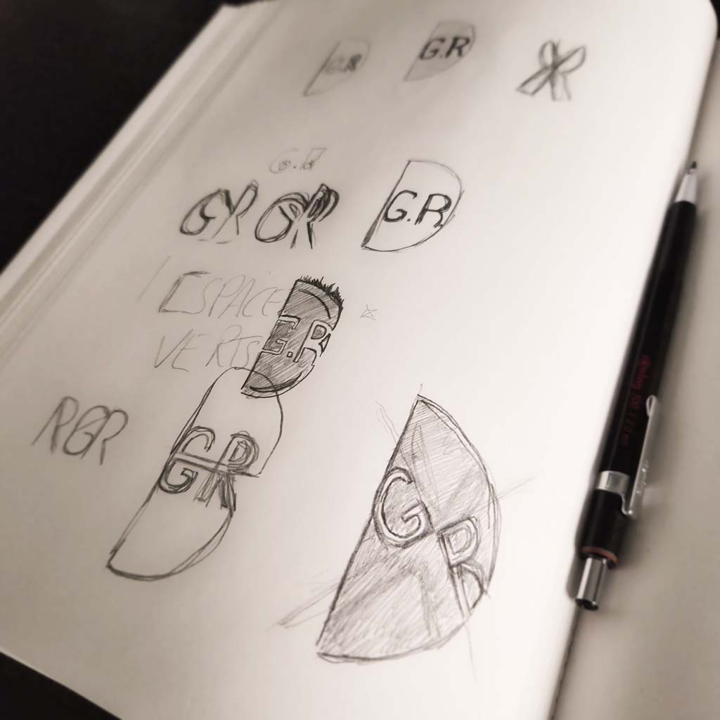
Found in pencil
Like every logo, it began with pages of sketches. This time, the final logo was already there on paper, which is rare. Usually the sketches give the direction, and the right shapes, proportions and construction lines are found later on screen. Here, the pencil had found it all.
The business cards and the banner
Then came the business cards they had asked for at the start, with the detailed logo, a beautiful green and the founders' contact details.
They also needed a large printed banner, for their worksites or their vehicle, so I prepared the flat version of the logo for it, made to be read from a distance.
A logo found in pencil, and still one of those I am proudest of.