
Identity and website for a Luxembourg company built around an interior architect and her business partner, with their team of craftsmen specialised in natural stone.
Context
A fifty-year-old company changing hands. The founder's name leaves with him. The new managers, an interior architect and her partner, need a name, a logo and a site that carry the history without carrying the old brand.
Four trades under one roof: fireplaces, bathrooms, natural stone work (marble, granite), interior and exterior fittings. Active in Luxembourg, Belgium, France and Germany.
Creating the logo
The aim was to start again from a blank page while keeping the red and orange, inherited from the former identity built around a flame. The company's activities had widened over time, so the logo no longer had to carry one service in particular, and it grew around the managers' initials.
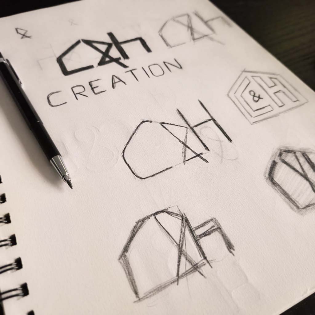
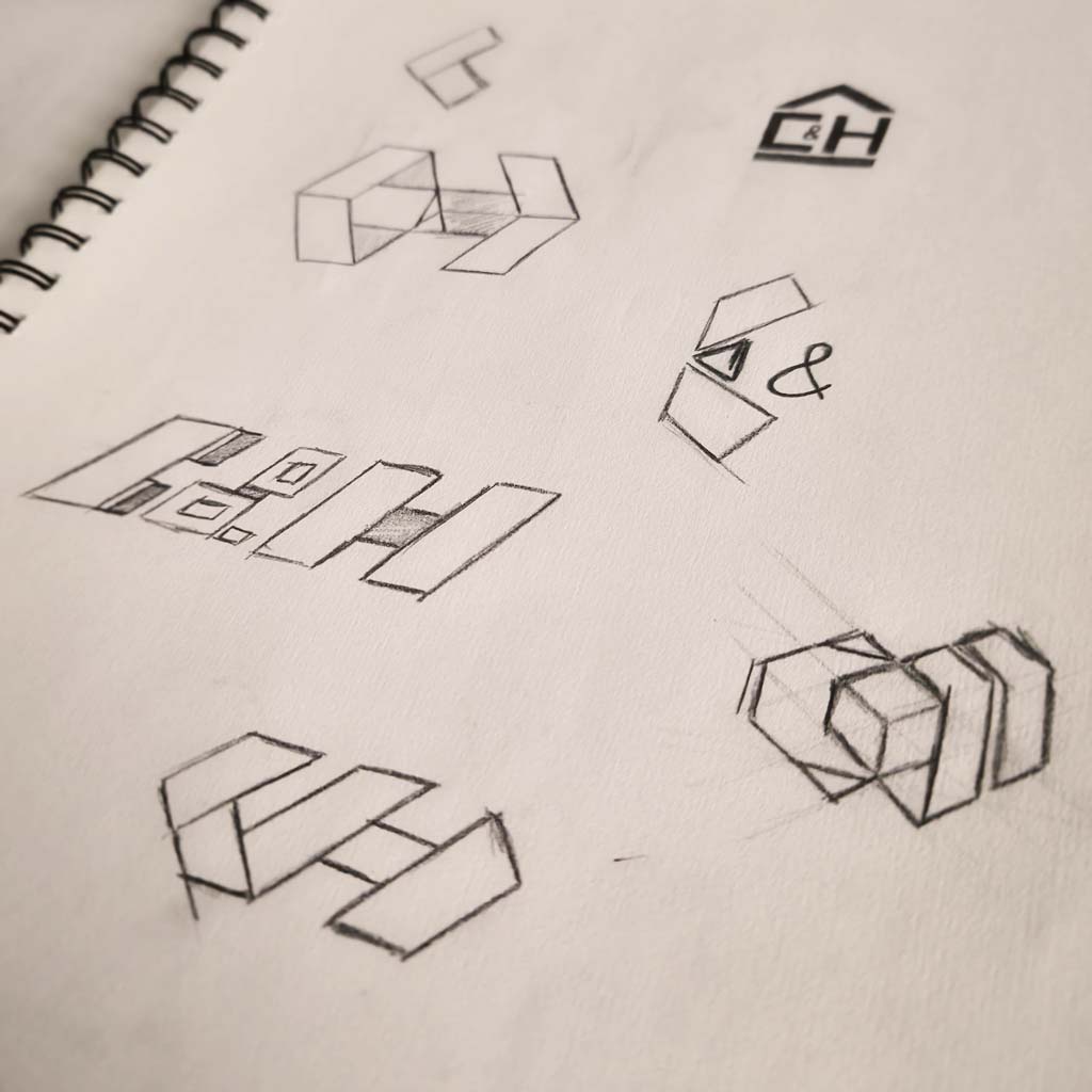
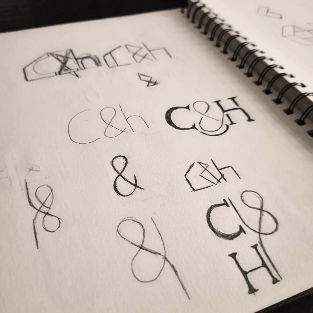
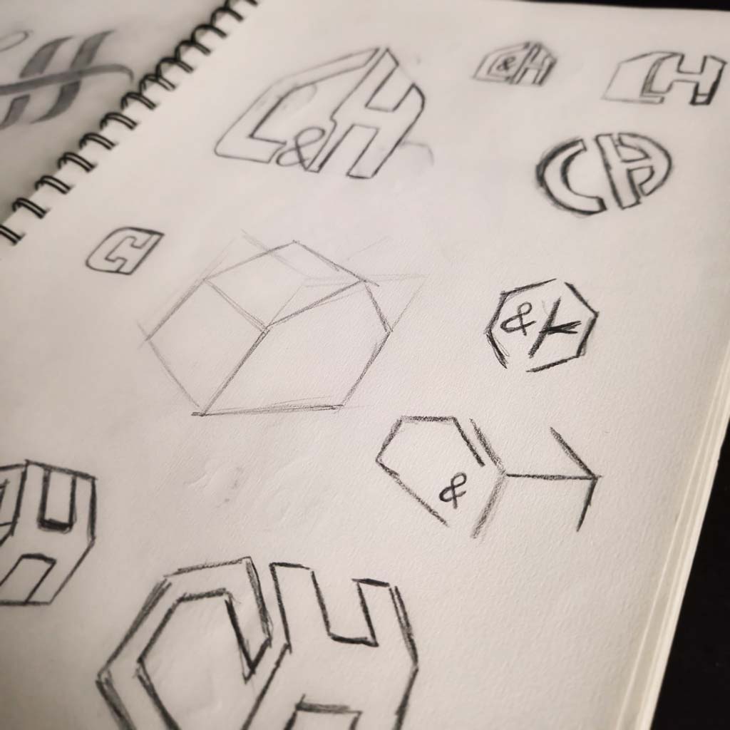
3 distinct directions
came out of the drawings



The final choice
Building the website
Designing the site
A custom WordPress showcase site for an interior architect and her renovation company in Luxembourg. I started from a blank page, never from a template. Four trades to bring together: fireplaces, bathrooms, natural stone, interior and exterior fittings. And one rule I set myself: the site had to live up to their work.
Art direction
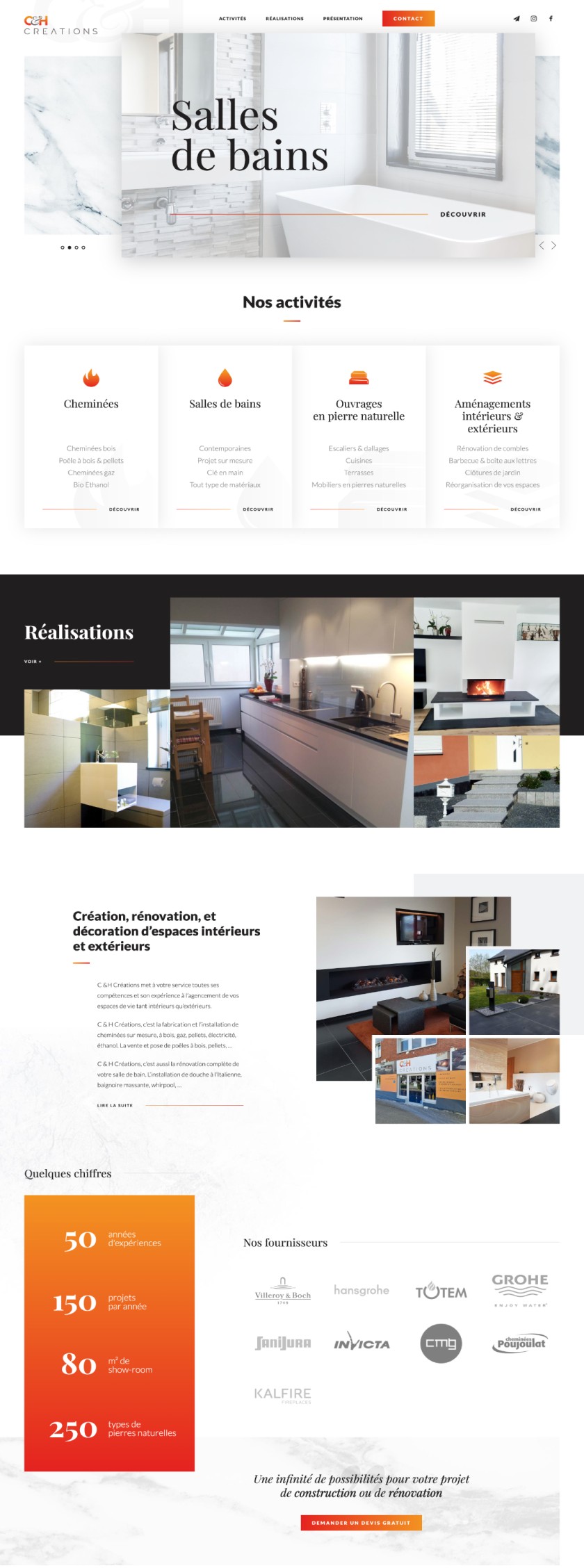
The stone set the tone. Marble and granite full width from the first screen, raw textures behind every section, and colours taken straight from the materials rather than from a chart. I wanted the site to be visited like their showroom: you touch the material before you read. I also drew one icon per trade, in the same line as the logo, so the identity holds from end to end.
The rhythm of the content
Little text, many images: that is what I had in hand. Rather than filling paragraphs, I built the site in short blocks that tell the company's story in their place: the four trades, the projects, the showroom, the figures, the suppliers, the testimonials. Each section answers the question the visitor has at that moment and leads to the next, up to the quote request. The design makes the case, the text confirms it.
Attention to detail
Animated interactions
The web is an interactive medium: animations that show an element is about to trigger an action on click matter, they guide the user.
And creating those animations with elegance is a big part of a website's visual identity. Besides being genuinely fun to build.
The whole art is finding the right dose, since too many animations can hurt performance, or confuse a user and make them leave.
The structure of the site
Everything starts from the home page, which is a bit of the site in miniature. You walk down it like a showroom: the material first, then the four trades, the projects, the story, the figures, the testimonials, and at the very bottom the quote request.
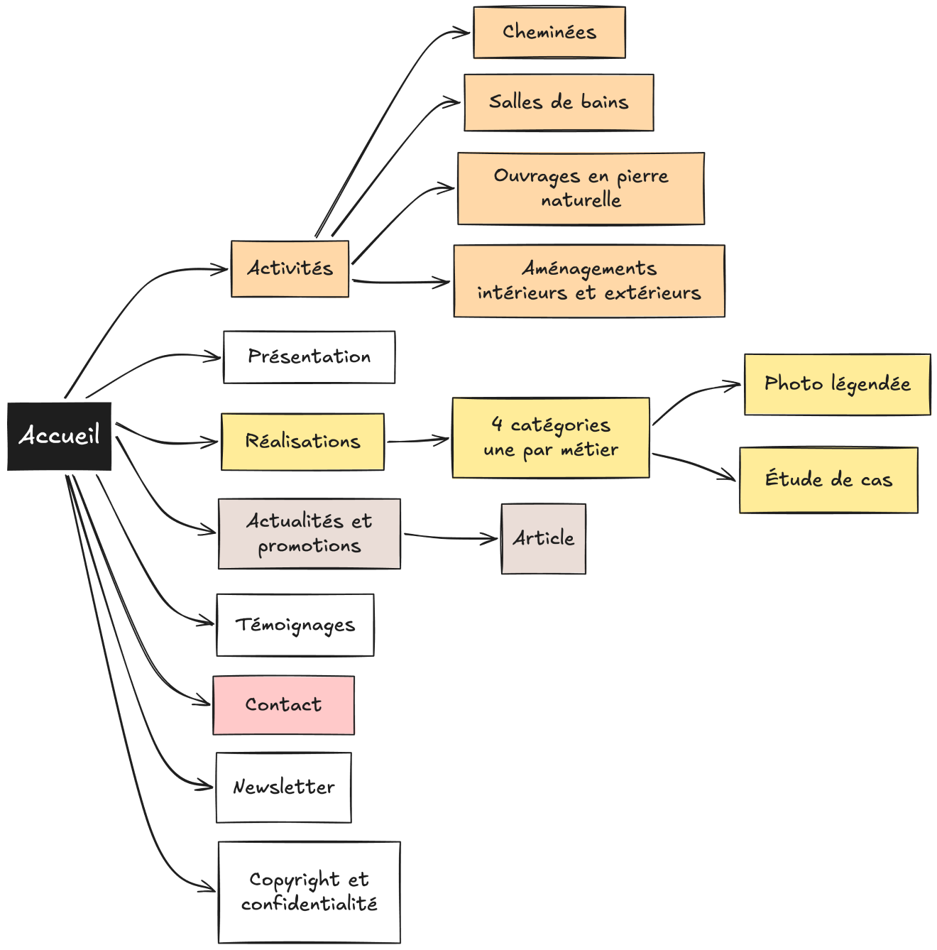
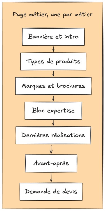
Then, two paths. Whoever already knows what they are looking for enters through a trade: fireplaces, bathrooms, natural stone or fittings. Whoever prefers to know who they are dealing with first goes through the presentation, which leads to the same four pages.
The two paths meet on the projects and end at the same place: the contact. Around them, the news, the testimonials and the newsletter live at the company's pace, without ever touching the design. The client feeds them.
Technology choices
- WordPress
- Advanced
Custom Fields - Google
Analytics - Bootstrap
- JavaScript


Technique and longevity
The site rests on sound, reputable technologies known to many developers, so that maintenance stays simple and the project can evolve over time.
A custom-built WordPress theme, with the simplest possible interface on the client's side so they can edit the content without difficulty.
Custom features
- Projects
- News
- Testimonials
- Newsletter sign-up
- Contact form
Two sites in ten years for the same team, and the second has been online since 2018. The news, the testimonials and the newsletter live at the company’s pace, without the design moving a pixel.
A logo born of a change of hands, and a site that ages with it: that is what I aim for, an identity that holds over time.