Identity and website for an independent contractor who installs ventilation units, air conditioning and the lining of ventilation ducts, for homes and industry.
Context
A freelancer launching his own business. He knows his trade, he has practised it for others, and he starts his own with everything still to build: an identity, printed material, a website. Nothing existed yet, which is the freest situation for a graphic designer and the most demanding for the person starting out.
His trade: installing ventilation units, air conditioning and the lining of ventilation ducts, for private homes as much as for industry. A technical field, barely visible once installed, that his clients need to understand before asking for a quote.
Logo design
The name was already there: Confort Air Ventilation, with his family name underneath. What remained was to give it a shape. The direction was clear from the first conversation: you had to see the air in motion, and the whole thing had to carry a technician’s seriousness.
The preparatory sketches
As with most of my projects, it all starts in my sketchbooks with a mechanical pencil. The client’s direction was clear; finding a strong way to draw the fan blades was the real difficulty.
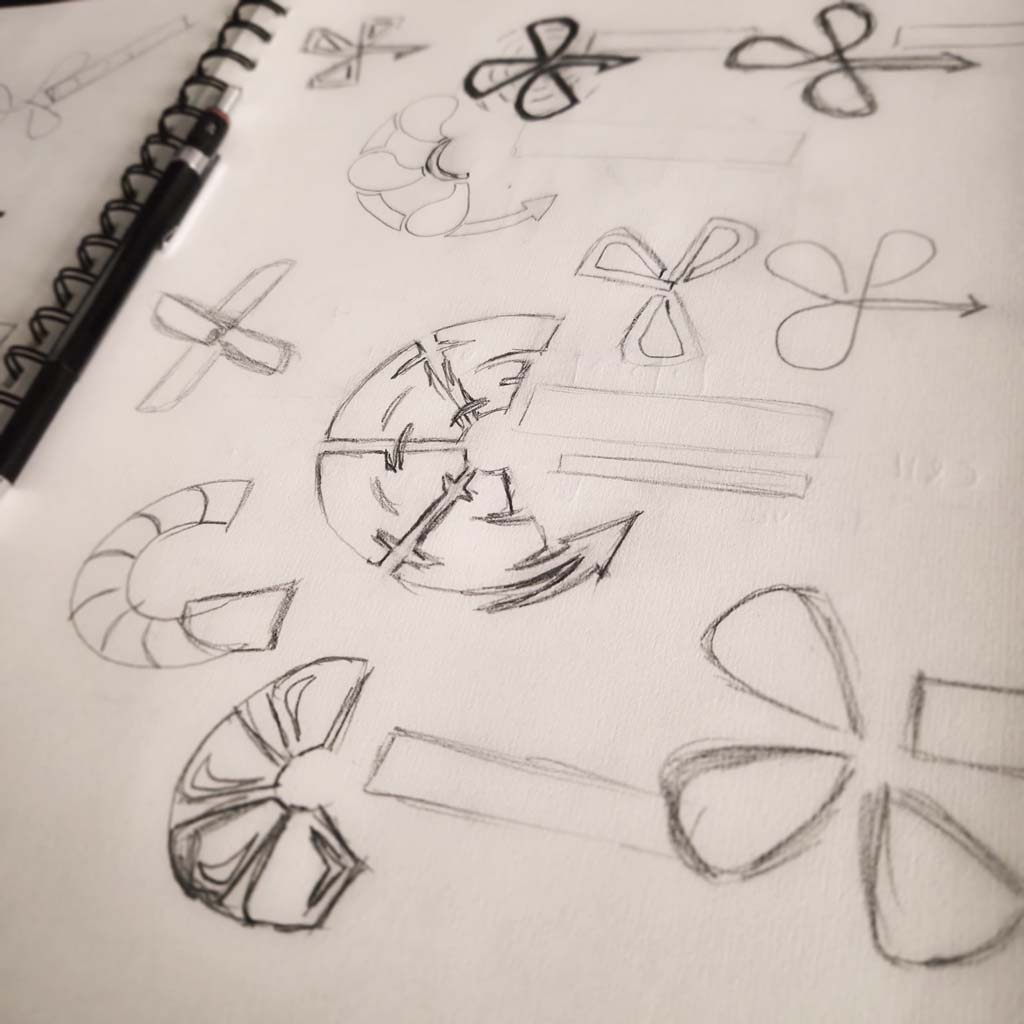
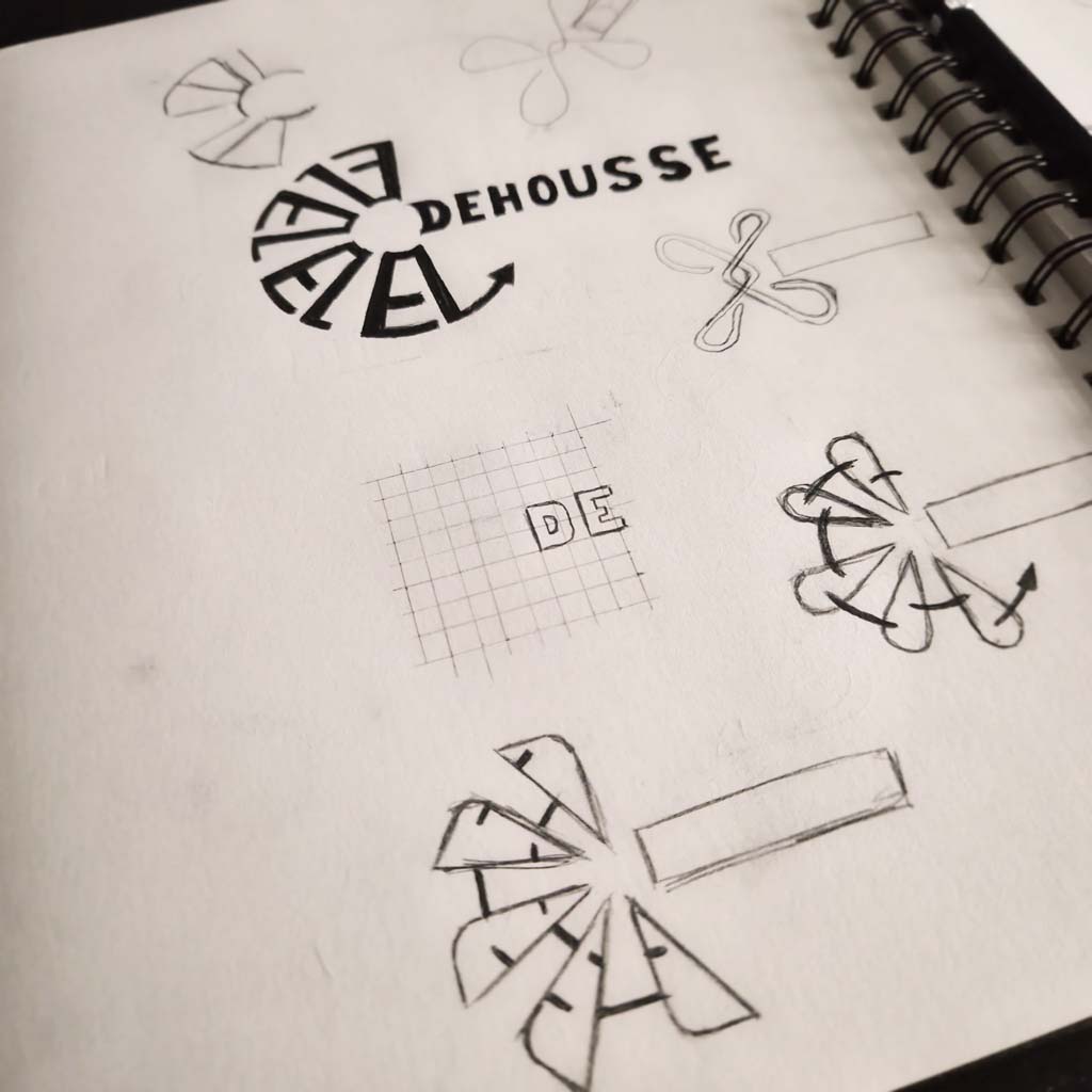
The three propositions made to the client
Once the sketches sent to the client were approved, we agreed on incomplete blades forming a crescent, with an arrow rising to stand for the renewal of the air. That is what guided the three digital propositions I sent him next.
Here, the three propositions all carry the heart of the trade and the symbols of renewal, energy and efficiency.
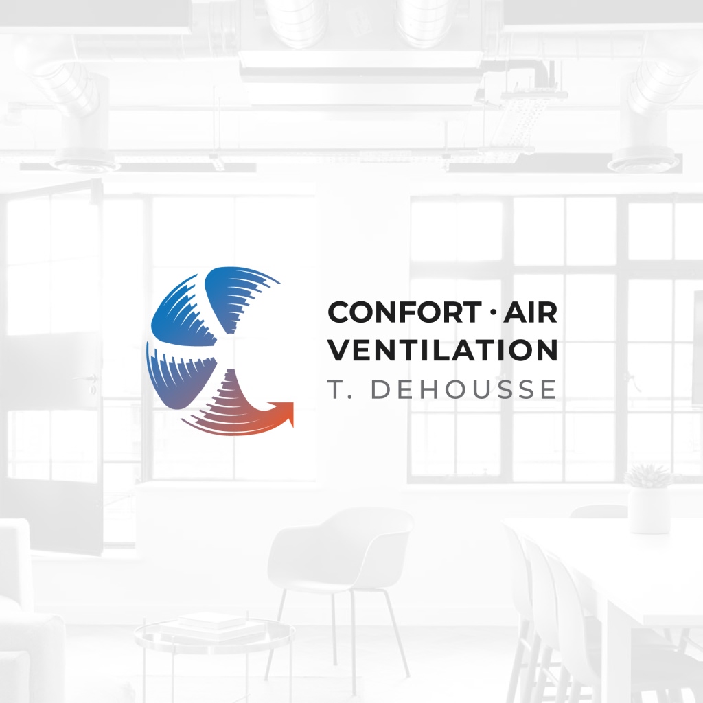
The first, the one he chose, was more dynamic, with a quicker, sharper, efficient feel. Blue and orange-red were chosen to mark the air conditioning side but also the double flow, one of the ventilation technologies the client installs, which keeps the heat inside the house.
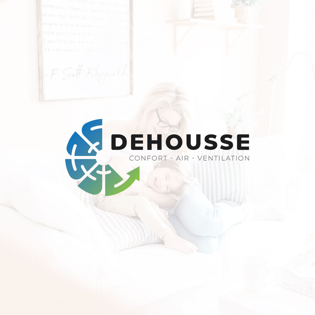
The second proposition was a rounder, lighter version, to strengthen the “comfort” carried by the company’s name. Same for the colours, with a blue-to-green gradient standing for a healthy renewal of the air.
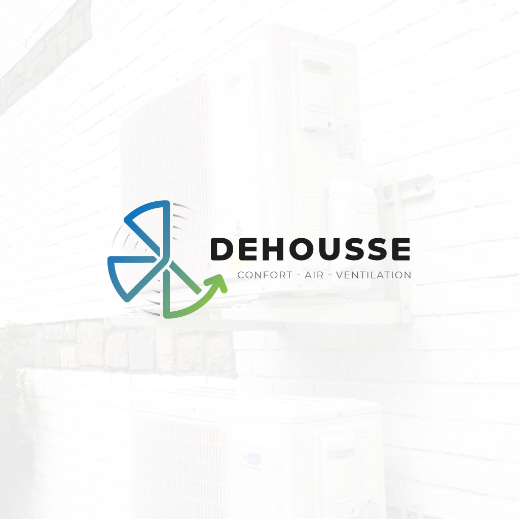
And the last one, which I liked a lot: one unbroken line drawing the blades of the fan and ending on the arrow, for reliability and support over time (maintenance contracts and so on).
The choice is always what I offer my clients, so they get the logo they dream of for their company or for one of their projects that needs an identity of its own. And every proposition I make is entirely viable, or I do not propose it.
Website design
Once the logo was approved, we moved to the site. The budget of a freelancer starting out is not the budget of an established company, and that is a constraint I like: it forces you to keep only what truly works. No effect for the sake of the effect, no technical showing off. Every choice had to serve one thing: that a private client or a company understands what he installs, and gets in touch.
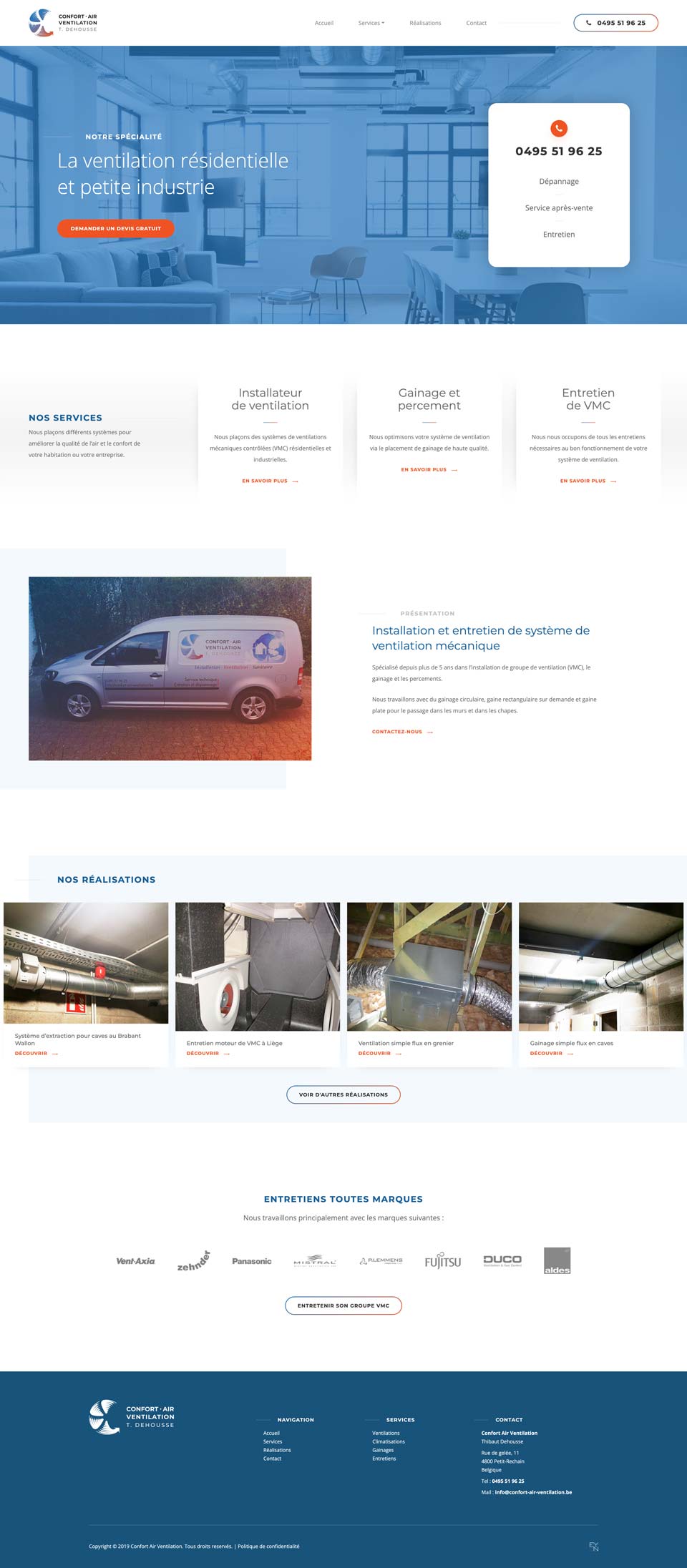
A clean, detailed style
The blue and the orange-red of the logo lead the page, on white and light greys. Plenty of air, few elements per screen, all of it extending the logo’s identity. A technical site does not need to be cold, it needs to be readable, hence the subtle details that add richness without disturbing the reading: shadows, light blue flat areas, fine lines…
A projects module
Every finished job becomes a project: photos, a few lines of text, the type of installation. Each project becomes a page, and the client adds them at his own pace, from his admin area, without ever touching the code or needing to contact me. And that contributes a great deal to search visibility, because each job matches what someone looking for a technician in their region types, for example “Servicing a double-flow ventilation unit in Liège”.
Content optimised for search
To help the client on this project, I had written the texts for him. They are written with the words his clients actually type into Google: single-flow and double-flow ventilation units, duct lining, and the regions he covers. Each service page carries its own subject and can be found on its own, without going through the home page.
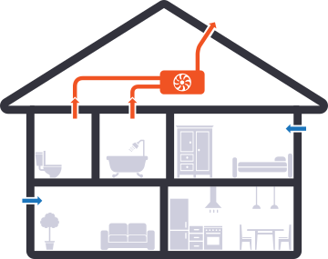
Clear illustrations to explain technical concepts
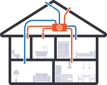
For one of the service pages it mattered to draw the difference between the two ventilation systems the client installs.
Making a technical concept easy to read, with custom illustrations in the style and colours of a company’s identity, helps the visitor understand what is being sold and choose what suits them. It is part of the sales journey: the client can then contact you having already understood your products.
A dedicated page for each project
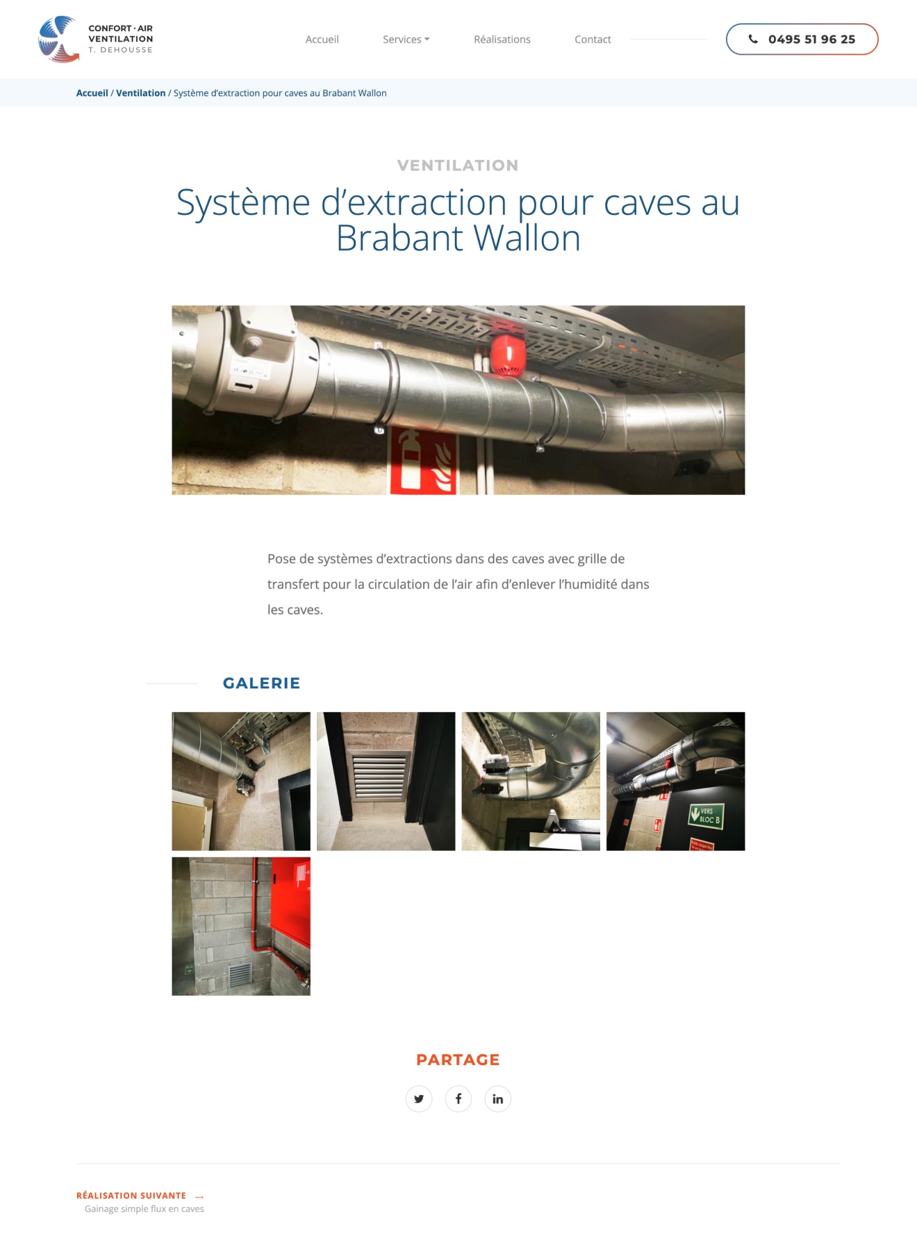
Every project has its own address and its own page: the photos of the job, the context, the equipment installed. One more page that can climb the search results, and a precise link to send to someone who is hesitating.
Here is what a project page is made of:
- The page title carries the words of a local search made on Google.
- A banner image standing for the project.
- A completely free text to explain how the project went, what was installed…
- A gallery with all the images of the project.
- Links inviting people to share the page on social networks.
Technology choices
- WordPress
- Advanced
Custom Fields - Google
Analytics - Bootstrap
- JavaScript


Technique and longevity
The site rests on sound, well-known technologies that many developers master, so that maintenance stays simple and the project can evolve over time.
A custom-built WordPress theme, with the simplest possible interface on the client’s side so he can edit the content without difficulty.
Custom features
- Projects
- Contact form
Online since 2019, without a single interruption. The client has a full schedule, and still he updates his site himself: a new project, a photo, a line of text, without going through me.
That is exactly what I aim for with a custom site: that it truly belongs to you, and that it still looks elegant and modern seven years after going live.