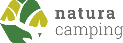
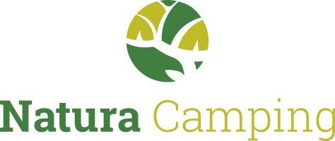
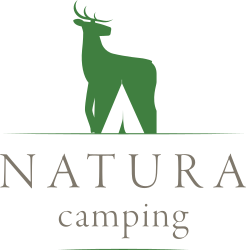
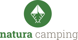
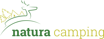
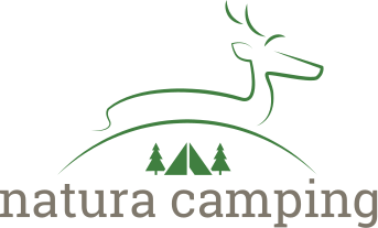
The logo of a campsite and its gites in the Ardennes, drawn as the test for my first agency job, from the pencil sketches to six propositions around a deer and a tent.
The context
In 2015, fresh out of my studies, I applied to a web agency. After a first phone call about my skills, they wanted to see me at work, with a test in two parts, a logo first, then a web exercise on site. The role was for a graphic designer and web developer, and I would later join the team.
The agency was based just over the border, in the Grand Duchy of Luxembourg, and its founders came from the Belgian countryside, where nature is everywhere and holiday campsites are plentiful. The brief imagined one of them, Natura Camping, a fictional campsite in the Ardennes, at the heart of a large natural area.
The brief
- Yellow and green, the colours the client saw for the logo
- A deer, the symbol of nature
- A tent or another typical camping object
- A natural side, clearly visible
- Something new and modern, with a breath of renewal
- One constraint on the shape, nothing square
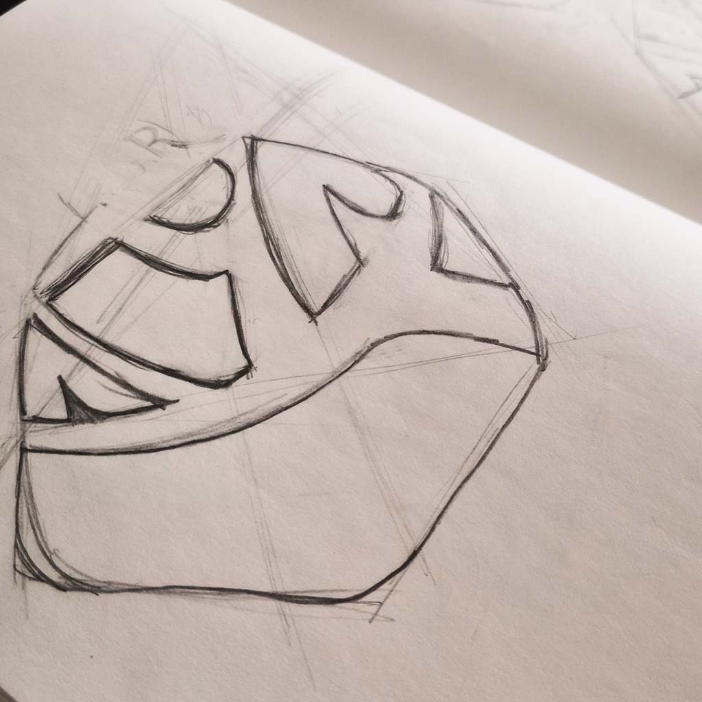
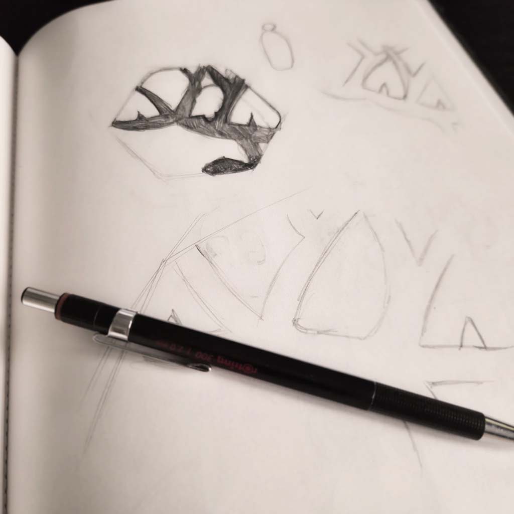
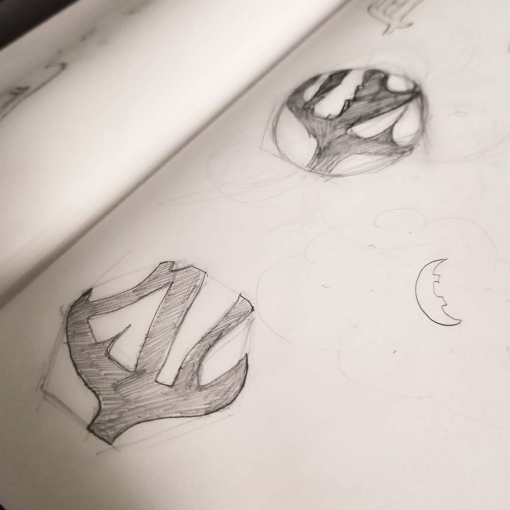
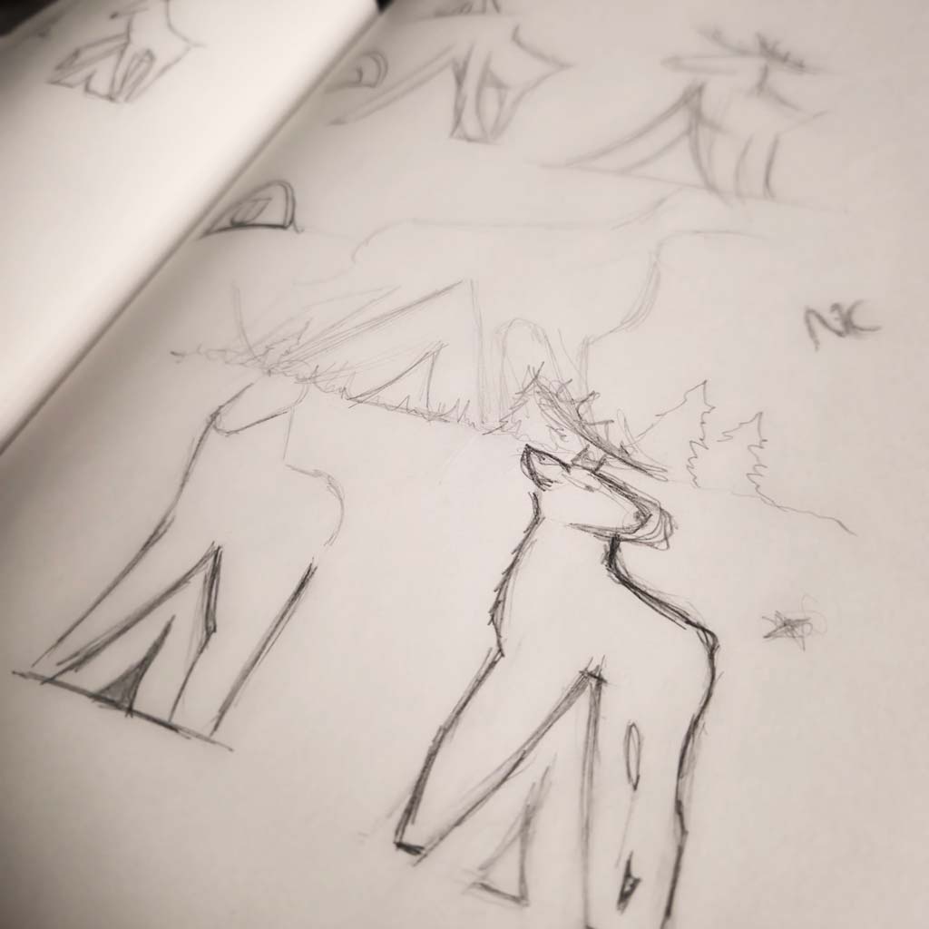
In pencil first. The sketches opened many ways into the project, and three main directions came out of them, each with a few variations.
The propositions
The outcome
They loved the propositions and my creative process, and this opened the doors of my first agency as an employee, because I could handle both the web and graphic design. I stayed a year and learned a great deal, then joined an agency closer to home, for a better balance between work and private life.
More than ten years later, I still start my logo creations the same way: a brief, a mechanical pencil, and several directions to compare.