
Visual identity and website mockup for a fictional architecture practice in Saint-Gilles, imagined to show how I approach an architect's website.
The project
Architects sell a way of seeing. Their website should be as carefully made as their plans, and yet many rest on a generic theme that looks like the neighbour's. To show what I can do for them, I invented a demanding client.
Adler & Voss is a Brussels practice founded in 2012 by two architects, a team of fifteen working in French, Dutch and English. Their projects range from the renovation of a mansion to the construction of a school, by way of extensions and interior architecture.
An established practice, with awards and publications, that needs a website worthy of its reputation.
The logo
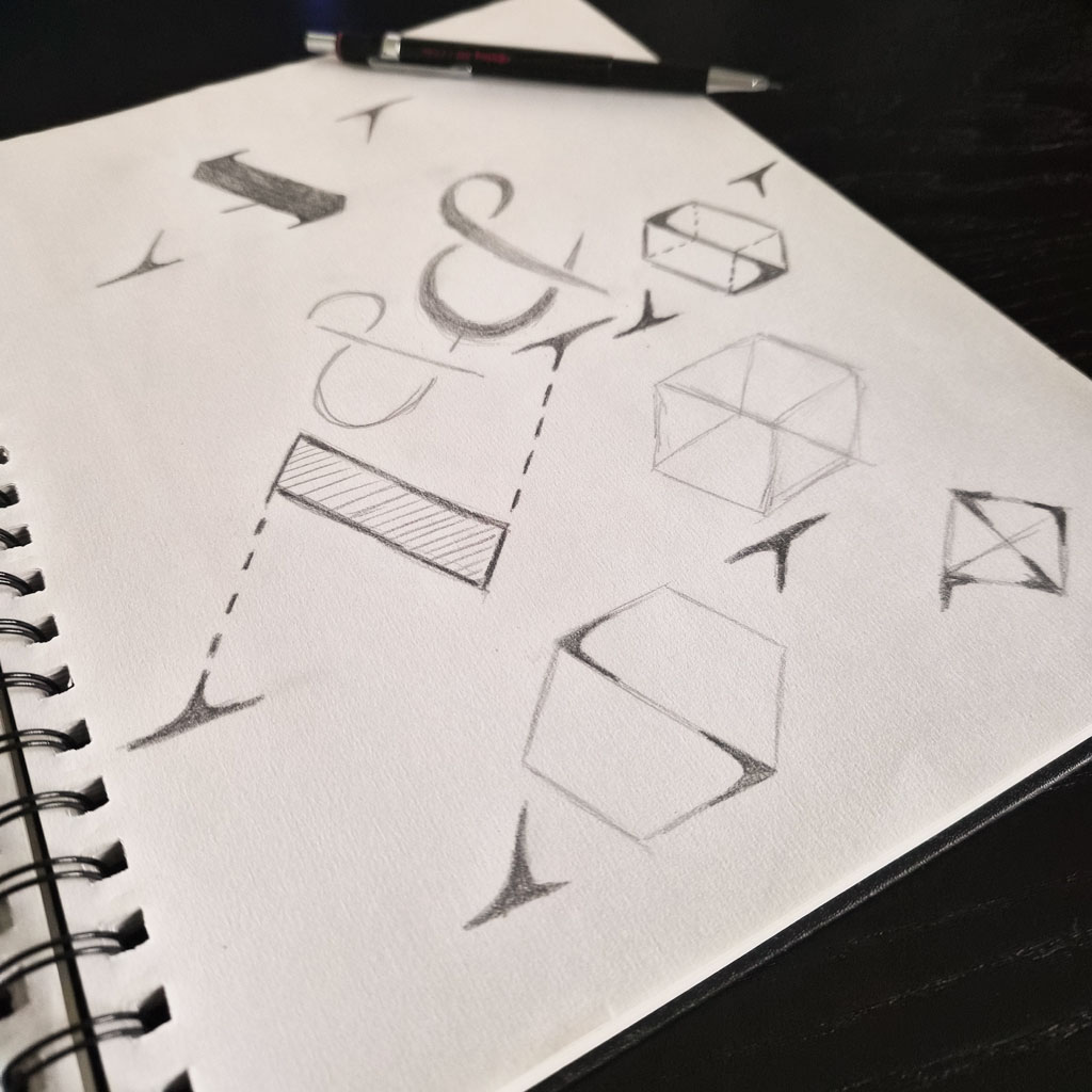
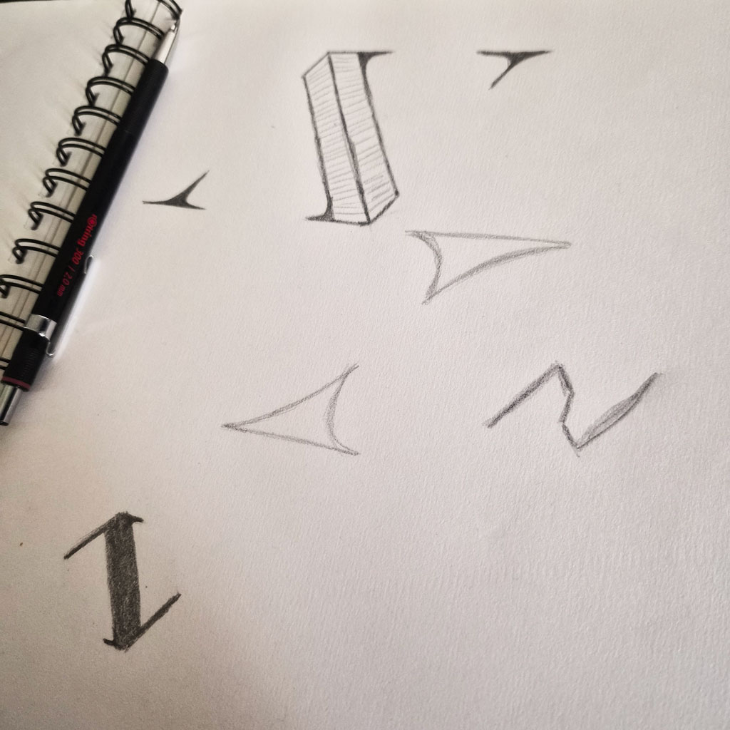
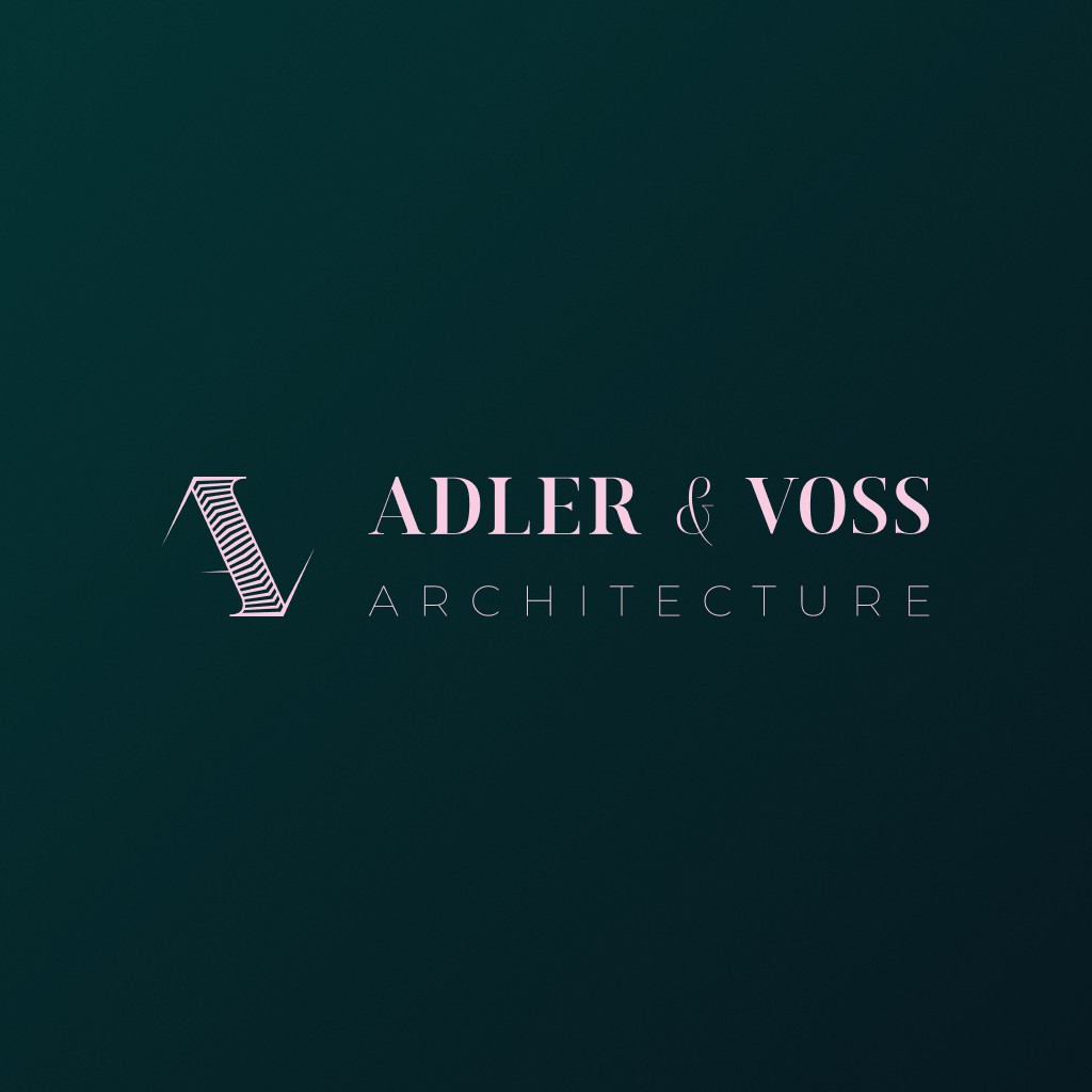
Two names, two cultures, one practice. The A and the V meet in a monogram, set in a hexagon that evokes both a plan and a piece of engraved metal.
The palette sets the tone at once. A deep emerald green and a very pale pink, thought of as a signature rather than brand colours. The green recalls patinated copper and ivy on stone, the pink lime renders and brick in soft light. Together they say a house of character more than a business firm.
The pencil work
The home page
The art direction
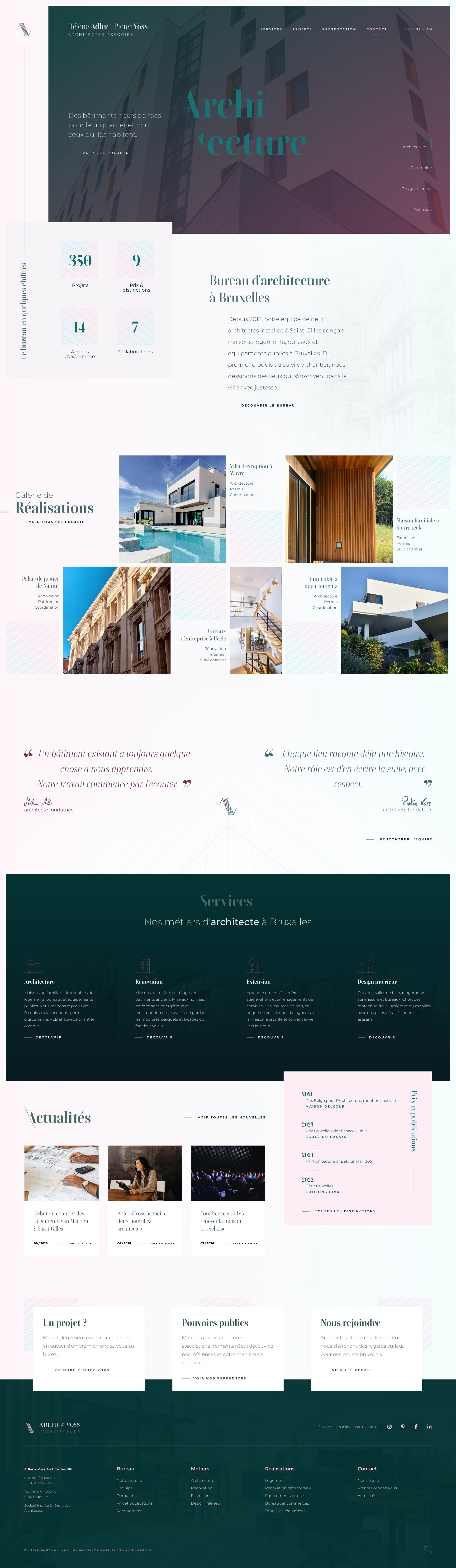
The projects come first, full screen, with the sentence that sums up the practice: “Places that last.” The pink is kept for text and details, never as a ground, so the emerald keeps all its depth.
The typography pairs a serif for the titles, elegant and calm, with a sans for everything else. It reads as a serious practice, never a cold one.
The rhythm of the content
You walk down the page the way you visit a practice. First the projects, then who they are and what they have built in numbers, the gallery of works, the two founders in their own words, their four trades, the awards and the news. At the very bottom, three doors depending on the visitor: a private client with a project, a public authority, a future colleague.
Each section answers the question the visitor is asking at that moment, and leads them to the next.
The attention to detail
Line icons
One icon per trade (architecture, renovation, extension, interior design), drawn in a fine line like an architect's sketch, all standing on the same ground line.
The rules
Fine one-pixel lines separate the awards and structure the page, like the hatching that fills a section on a plan. A vocabulary architects recognise without needing it explained.
An imaginary project, but a real method. Start from what makes a trade valuable, translate it into an identity, then build a page where every section has a reason to be.
Are you an architect whose website no longer looks like you? Let's talk.